NB! The blog readers are entitled to a 10% discount for PrepKit software, and the discount code is UCPREP.
I had a possibility to evaluate uCertify's PrepKit software again. The last time I have evaluated the PrepKit package for SCBCD5.0 exam. This time I have evaluated the package that is intended for Sun Certified Programmer for the Java Platform SE 6 exam preparation. The software itself could be downloaded from the uCertify website.
I really liked how the practice tests are organized and the way you can combine the tests while studying.
The GUI is quite intuitive and you can easily navigate within the software. It was even quite comfortable to use on my 10.1'' netbook's screen.
Study and learn
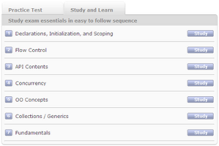
You can find the "Study and Learn" section on the main screen. This is where you can study the material broken into topics by the content, and this is where the not-so-nice facts appear when using this PrepKit.
First of all, the explanations for the study material look quite boring. Just see the next screenshot - it just text, not attractive at all, and probably it will not even engage the users to read it. I do not know what to suggest (I'm not a usability expert) but it seems that this is a challenge for a professional designer to make such screens "sing".
Another strange example of the studies section behavior is when you are given a test question with a code snipper, like this:
To see the correct answer for this question you have to move forward with the 'next' button, which is quite inconvenient. Instead, it should have a 'show answer' button for this particular question. IMHO, this a usability issue again.
Questions in PrepKit
This PrepKit contains quite a lot of tests, easy and difficult ones. This is good when you have a lot of questions inside the package, specially in case you have paid for this software.
But lets be more critical. My annoyance comes from the text in the questions provided by this PrepKit - a-la "Mark works as a programmer in...", "Stella writes a program for ...", "Joe works as a programmer for...". I'm asking you now - who the hell cares?!?! This kind of text takes ~10% of my time to read this question and gives no value to it. This should definitely be amended. Here are some screenshots showing this issue.
Here's the small example ..
Here's an other one ..
And here's what it will look like after you have completed the test and want to see the result:
Meaningless, isn't it? OK, not that negative :), but it could be better without such sentences.
An other frustrating thing is the bad-formatted code and strange naming of the classes/variables. Perhaps, this is due to make the questions look exactly like in Sun's certification exam? Here are some screenshots:
 |  |
The negative examples aside, the tests are well-prepared and there's a variety of questions that will make you think deeper, which parts of the exam you need to learn more. For me the good example is the drag'n'drop-like questions:
Explanations
The explanations for the test a rather comprehensive, but sometimes you may find some mistakes, like this one:
The code snippet looks odd, doesn't it?
Overall it is a very good idea to the the user not only if his answer was correct or not, but also explain, why was it correct or why it was incorrect.
Summary
I'm very sure that uCertify's PrepKit software is a good choice if you are looking for a training materials for Java certification. Although, the PrepKit still has some flaws in it, still with the continuous improvement and a discount code (UCPREP) it is a good investment in your education.


2 comments:
Thanks for writing this!
I just got a mail where they wrote: "Use promotion code “DIWALI” and save an additional 15%. Last day 24th Oct 2009."
Hello Lauri, I have also received this mail but one thing that I noticed that "DIWALI" is valid for only few days. but "UCPREP" is valid forever.
Post a Comment